
Apple
Every product gets the whole screen to itself.
- Category
- Stores
- Kind of business
- Electronics and Gadgets
- Style
- Minimal, product first
- Known for
- Its product photography
- Best for
- Brands with flagship products
- Category
- Stores
- Kind of business
- Electronics and Gadgets
- Style
- Minimal, product first
- Known for
- Its product photography
- Best for
- Brands with flagship products
See how it looks
 apple.com
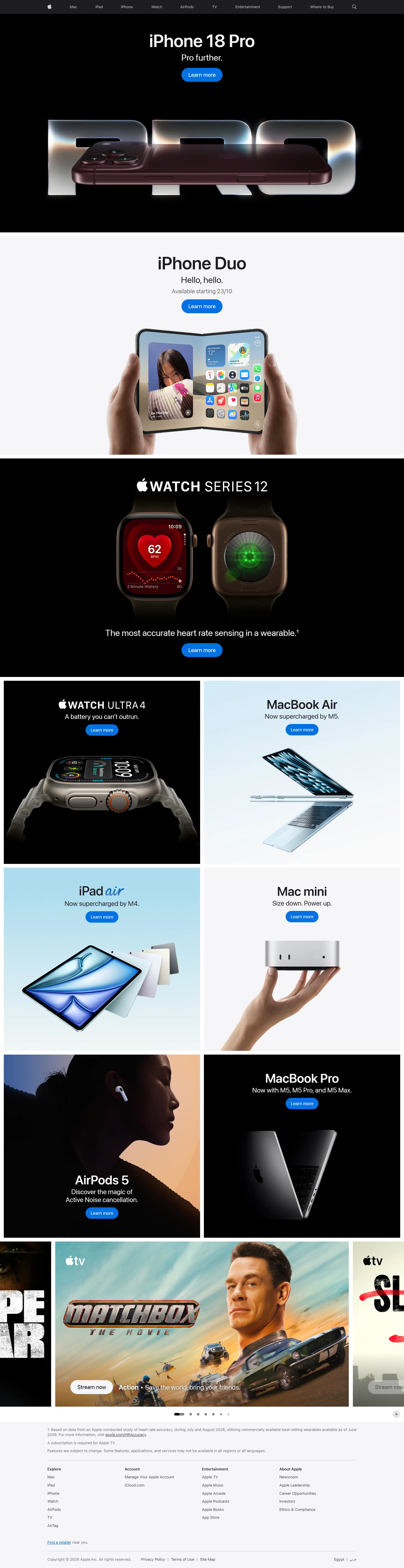
Each reference belongs to its owner and is shown here for ideas, with a link to the real website.
Every website we build starts from a conversation, not a template. Pick what you like here, from a whole page down to one detail, and we will shape it around your business.
About this reference
Apple’s home page gives each product its own band: one large picture, a short headline, a one-line promise and two buttons, then the next product. Black and light bands take turns, so the page keeps a rhythm with nothing extra on it.
A reference for any business with a few flagship products: one message per screen, photography that does the selling, and the same calm buttons everywhere.
Ideas worth taking
- One product per band, with nothing competing
- A headline of a few words and a one-line promise
- The same two buttons under every product
- Dark and light bands alternate to pace the scroll
Tell us which parts you like. We shape them around your business.
Bring us the problem.
We’ll find the cause.
Tell us what slows your business down. In one meeting we find the constraint behind it and show you what removes it.
